What Are Some Benefits Of Using Graphs Of Frequency Distributions
Breaking News Today
Mar 20, 2025 · 6 min read
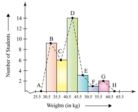
Table of Contents
What Are Some Benefits of Using Graphs of Frequency Distributions?
Graphs of frequency distributions are powerful visual tools used in statistics to represent the frequency with which different values or ranges of values occur in a dataset. They offer a clear and concise way to understand the distribution of data, making them invaluable in various fields, from business and economics to science and engineering. Understanding the benefits of using these graphs is crucial for anyone working with data analysis. This comprehensive guide will explore the advantages of using graphs of frequency distributions, detailing their applications and highlighting their importance in making informed decisions.
Understanding Frequency Distributions and Their Graphical Representations
Before diving into the benefits, let's clarify what frequency distributions are. A frequency distribution is a table that summarizes the occurrences of different values within a dataset. It lists each unique value and the number of times (frequency) that value appears. Graphical representations of these distributions transform this tabular data into easily interpretable visual formats. Common graphical representations include:
1. Histograms:
Histograms are bar graphs representing the distribution of numerical data. The horizontal axis displays the range of values (often divided into class intervals or bins), while the vertical axis indicates the frequency of values falling within each range. Histograms are excellent for visualizing the shape of the distribution, identifying potential outliers, and understanding the central tendency and spread of data.
2. Frequency Polygons:
Frequency polygons are line graphs that connect the midpoints of the tops of the bars in a histogram. They provide a smoother representation of the distribution, making it easier to observe trends and patterns. Frequency polygons are particularly useful when comparing multiple distributions.
3. Bar Charts:
Bar charts are used for categorical data, showing the frequency of each category. While not strictly a representation of a numerical frequency distribution, they serve a similar purpose in displaying the distribution of frequencies across different groups or categories. They are crucial for understanding proportions and comparing different groups.
4. Pie Charts:
Pie charts are circular graphs that depict the proportion of each category in a dataset. Each slice of the pie represents a category, with its size proportional to its frequency. Pie charts are best used when illustrating the relative contribution of different categories to the whole.
Key Benefits of Using Graphs of Frequency Distributions
The power of graphical representations of frequency distributions lies in their ability to convey complex information quickly and effectively. Here are some of the key benefits:
1. Visualizing Data Patterns and Trends:
Perhaps the most significant advantage is the ability to visually identify patterns and trends that might be missed when analyzing raw data. A glance at a histogram can immediately reveal whether the data is normally distributed, skewed, or bimodal. This quick visual assessment provides valuable insights into the data's underlying structure. For instance, a skewed distribution might indicate the presence of outliers or biases in the data collection process.
2. Identifying Outliers and Anomalies:
Graphs effectively highlight outliers – data points that significantly deviate from the rest of the data. These outliers might represent errors in data entry, exceptional cases, or genuinely unusual events. Identifying outliers is crucial for data cleaning and ensuring the accuracy of further analysis. A histogram's visual representation clearly showcases data points far removed from the main cluster.
3. Understanding Central Tendency and Dispersion:
Graphs provide a visual representation of the central tendency (mean, median, mode) and dispersion (range, variance, standard deviation) of the data. The shape of the distribution gives clues about the central tendency – a symmetrical distribution suggests the mean, median, and mode are close, while skewed distributions indicate a discrepancy between these measures. Similarly, the spread of the data around the central tendency is clearly visible, offering insights into data variability.
4. Facilitating Data Comparison:
Graphs enable easy comparison of multiple datasets or groups. Plotting frequency polygons or histograms for different groups allows for immediate visual comparison of their distributions, revealing similarities and differences in their central tendency, spread, and shape. This is crucial for making informed decisions based on comparisons between different samples or groups.
5. Communicating Findings Effectively:
Graphs are highly effective tools for communicating data analysis results to a wider audience, including those with limited statistical knowledge. A well-designed graph can convey complex information more quickly and accessibly than a table of numbers, making it easier to understand and interpret findings. This enhances the clarity and impact of data-driven reports and presentations.
6. Enhancing Data Exploration and Discovery:
Visualizing data through graphs often leads to unexpected discoveries and insights. The ability to quickly identify patterns, trends, and outliers often sparks new research questions and hypotheses. This interactive aspect of graphical data exploration is invaluable in the iterative process of data analysis.
7. Supporting Data-Driven Decision Making:
Ultimately, the ability to understand and interpret data is crucial for making well-informed decisions. Graphs provide a powerful means of summarizing and interpreting data, making it much easier to extract relevant insights and to make evidence-based decisions. In business, for example, understanding the distribution of sales data can help optimize inventory management or marketing strategies.
Specific Applications Across Various Fields
The benefits of using graphs of frequency distributions extend across a wide range of fields:
1. Business and Economics:
In business, analyzing sales data, customer demographics, market trends, and financial performance relies heavily on graphical representations of frequency distributions. Histograms can reveal sales patterns, helping businesses optimize pricing strategies and inventory management. Bar charts can illustrate customer preferences, guiding product development and marketing efforts.
2. Science and Engineering:
In scientific research and engineering, frequency distributions are essential for analyzing experimental data, characterizing materials, and modeling natural phenomena. Histograms and frequency polygons are commonly used to visualize experimental results, identify potential errors, and assess the accuracy of measurements.
3. Healthcare:
Healthcare professionals use frequency distributions to analyze patient data, such as age, weight, blood pressure, or disease prevalence. Histograms can illustrate the distribution of a specific disease within a population, informing public health strategies. Bar charts can compare treatment outcomes across different groups of patients.
4. Social Sciences:
Social scientists employ graphs of frequency distributions to analyze survey results, demographic data, and social trends. Bar charts can display the distribution of opinions on social issues, while histograms can show the distribution of income levels within a community.
Choosing the Right Graph for Your Data
The selection of the appropriate graph depends on the type of data and the specific insights you aim to extract.
- Numerical Data: Histograms and frequency polygons are the most suitable choices for numerical data, revealing the shape of the distribution and identifying central tendency and dispersion.
- Categorical Data: Bar charts and pie charts are appropriate for categorical data, displaying the frequency or proportion of each category.
- Comparing Distributions: Frequency polygons are particularly effective for comparing multiple distributions side-by-side.
Conclusion: The Invaluable Role of Graphs in Data Analysis
Graphs of frequency distributions are indispensable tools in data analysis, offering a clear, concise, and effective means of representing and understanding the distribution of data. Their visual nature allows for the quick identification of patterns, trends, outliers, and other important characteristics that might be missed when analyzing raw data. Their applications extend across a vast array of fields, making them invaluable for researchers, business professionals, and anyone working with data. The ability to effectively communicate data insights through well-chosen graphs is critical for data-driven decision-making in all aspects of life. By leveraging the benefits of these graphs, we can enhance our understanding of data, make informed decisions, and ultimately unlock the full potential of our data-rich world.
Latest Posts
Latest Posts
-
Dod Mandatory Controlled Unclassified Information Training Answers
Mar 20, 2025
-
The Three Primary Goals Of Duct Design Are
Mar 20, 2025
-
Doubt Is To Suspicion As Confidence Is To
Mar 20, 2025
-
Who Normally Pays The Premiums For Group Credit Life Insurance
Mar 20, 2025
-
National Geographic Secrets Of The Body Farm Answers
Mar 20, 2025
Related Post
Thank you for visiting our website which covers about What Are Some Benefits Of Using Graphs Of Frequency Distributions . We hope the information provided has been useful to you. Feel free to contact us if you have any questions or need further assistance. See you next time and don't miss to bookmark.
